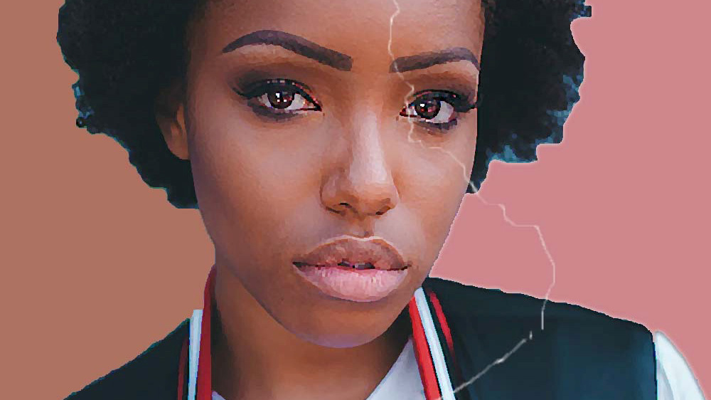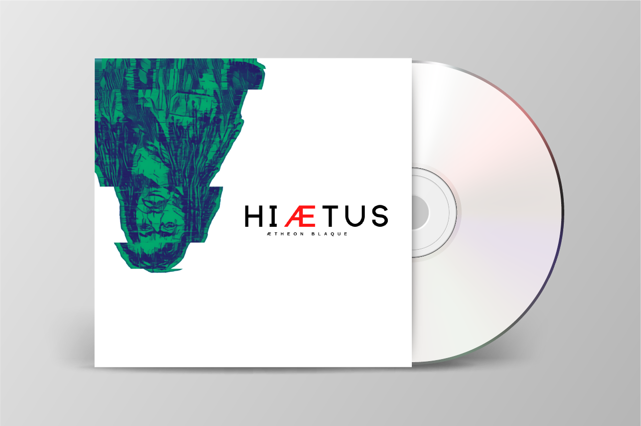


The client wanted a CD cover that captured the journey endured when on a hiatus, reflecting the struggles and triumphs along the way. I used muted, subtle colors and a distorted portrait of the client to represent the challenges faced while on this journey. To create a focal point, I added a pop of color representing the end goal of a hiatus, which is having the stamina to be your best. Also, I created a custom typography to personalize the design, creating brand familiarity and a visual that resonates with the client's name.